
Explore full-featured version of Theme Composer.
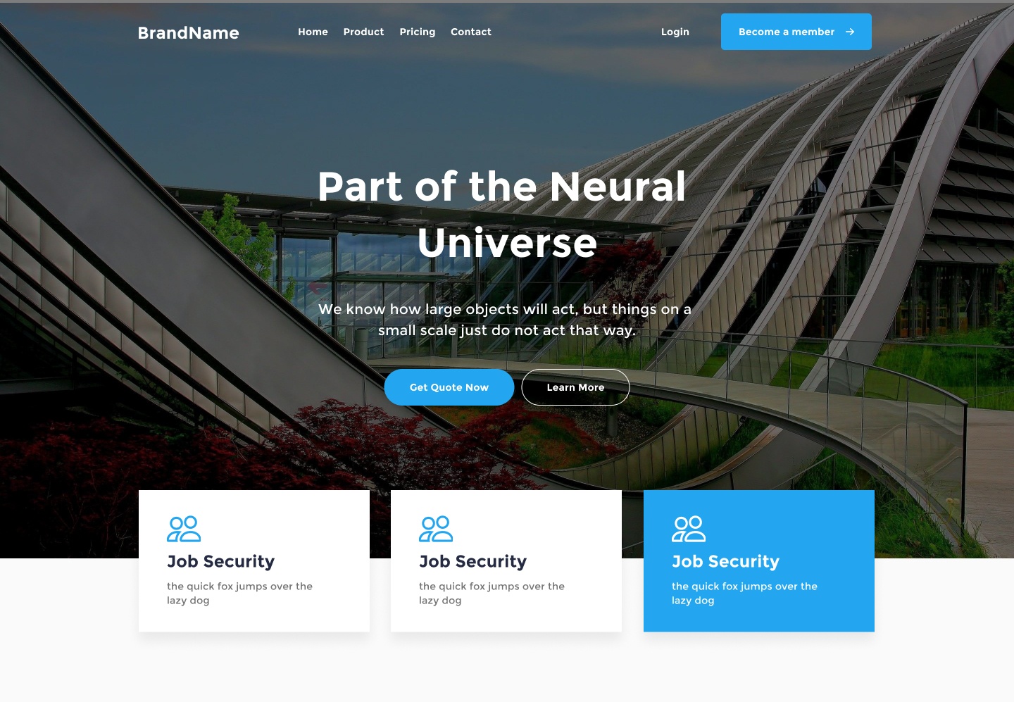
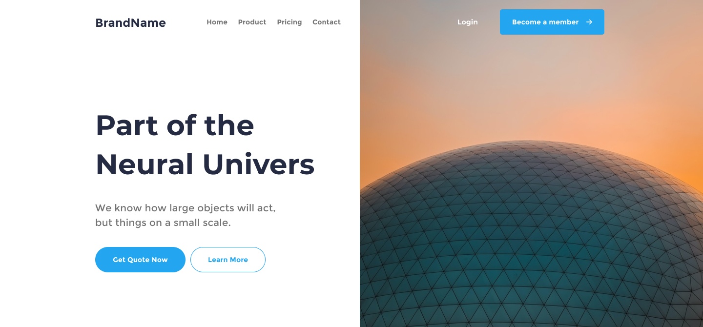
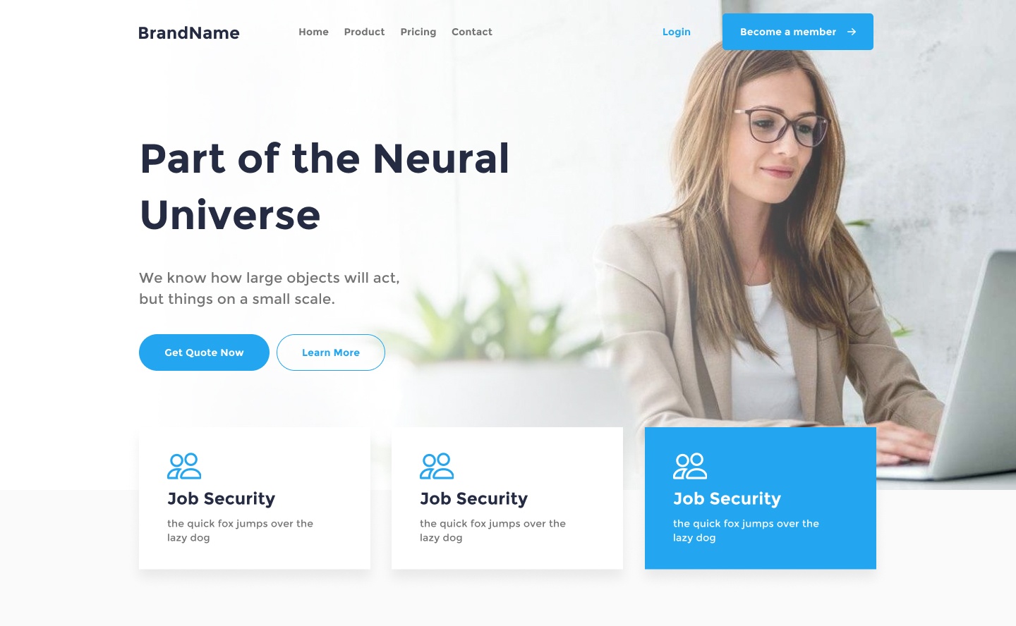
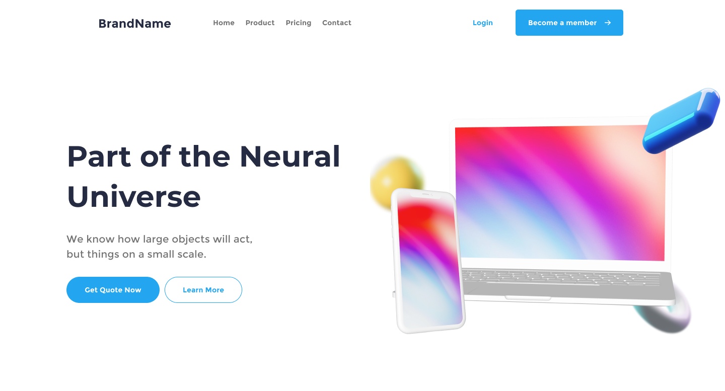
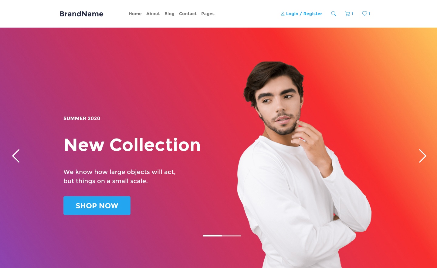
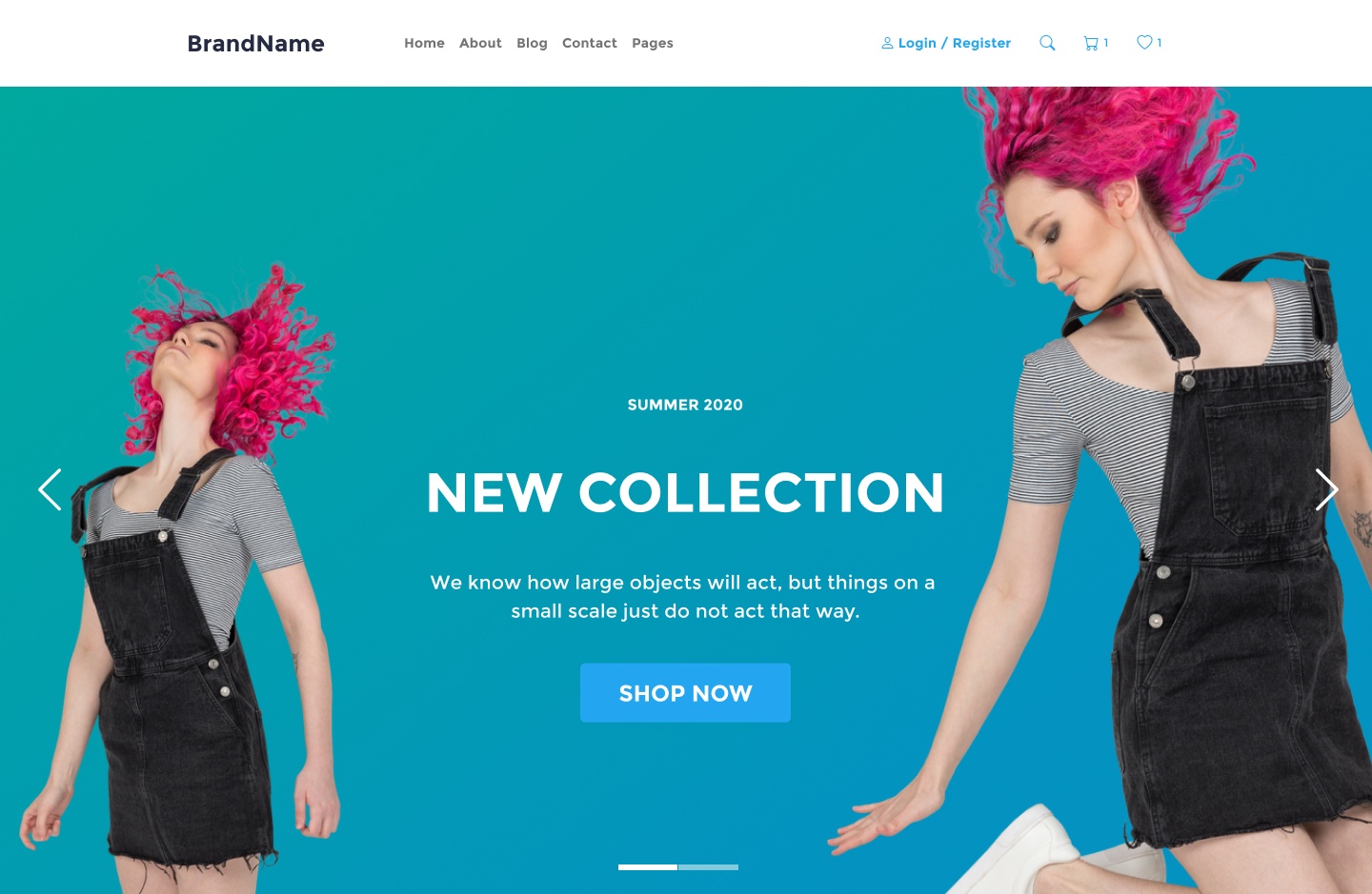
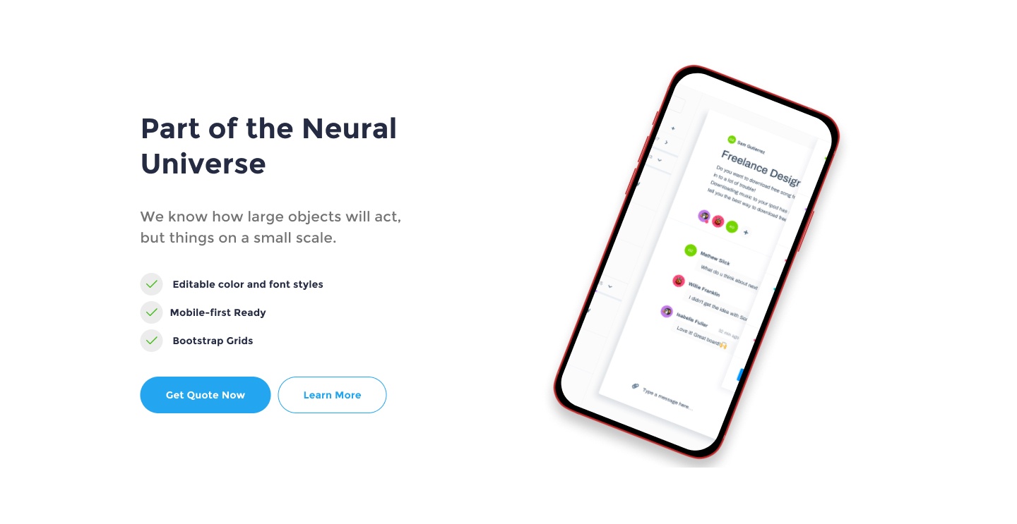
What can you build?
Theme Composer is carefully crafted Figma plugin allowing super-efficient custom designs.


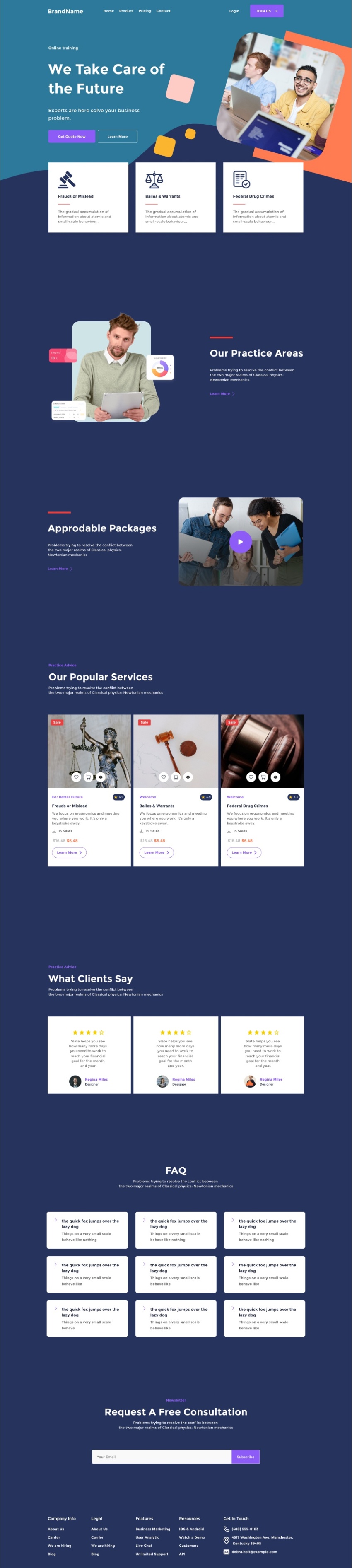
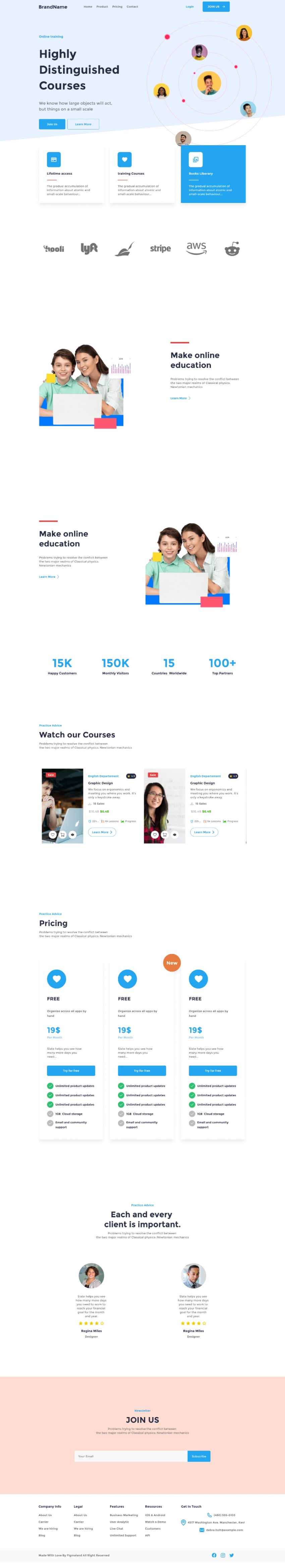
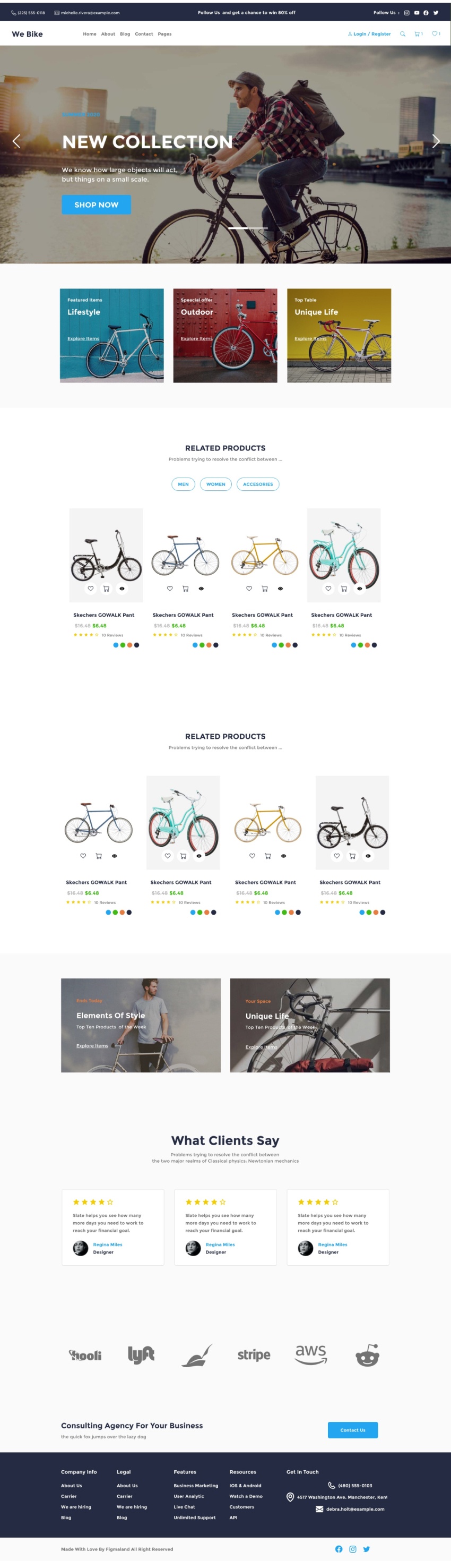
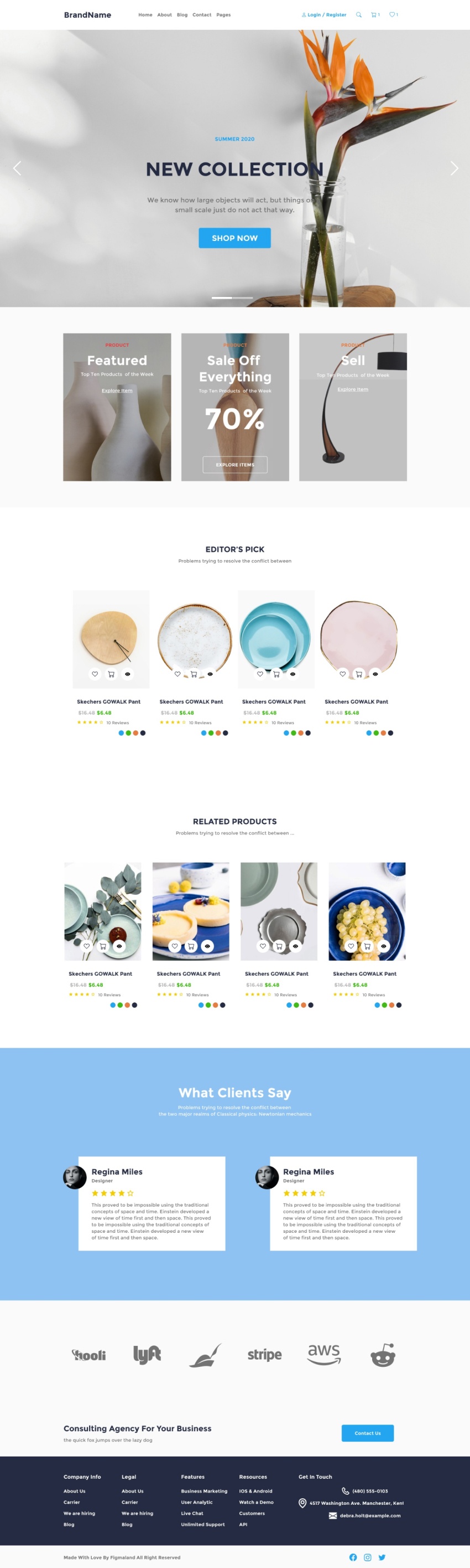

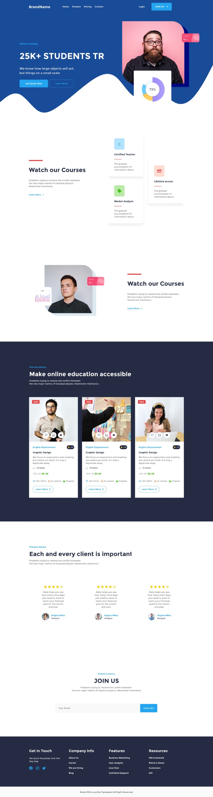
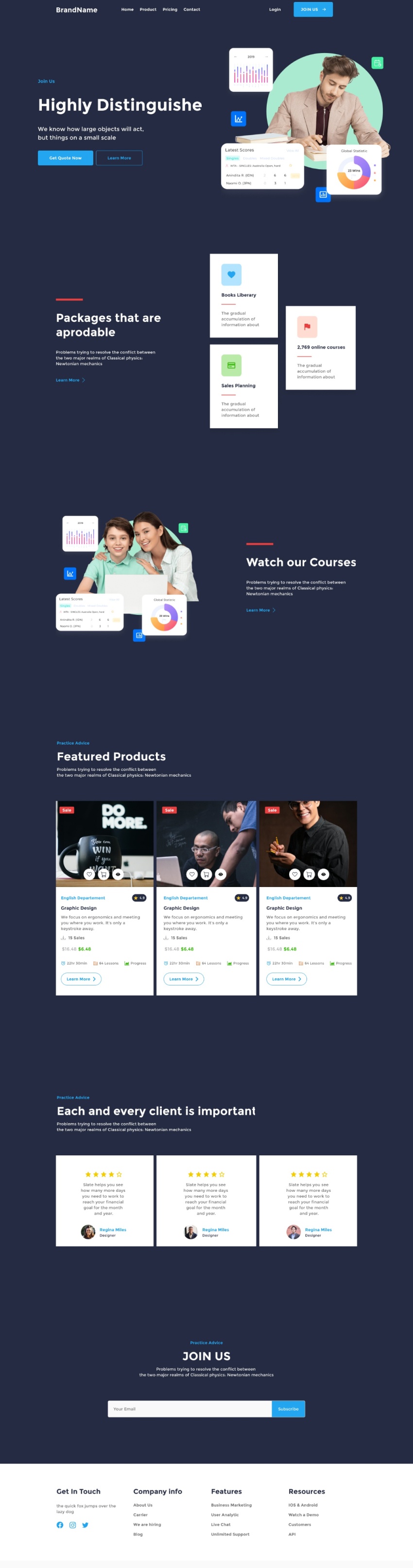
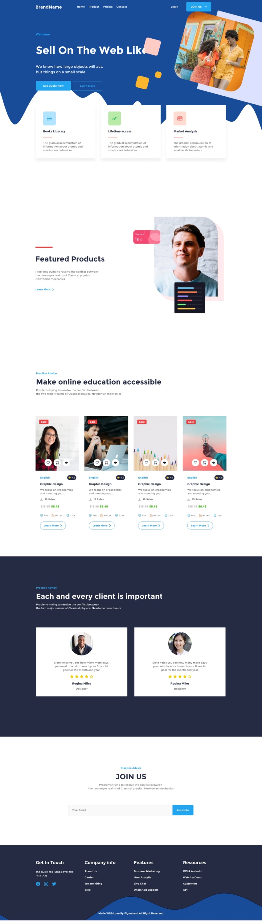

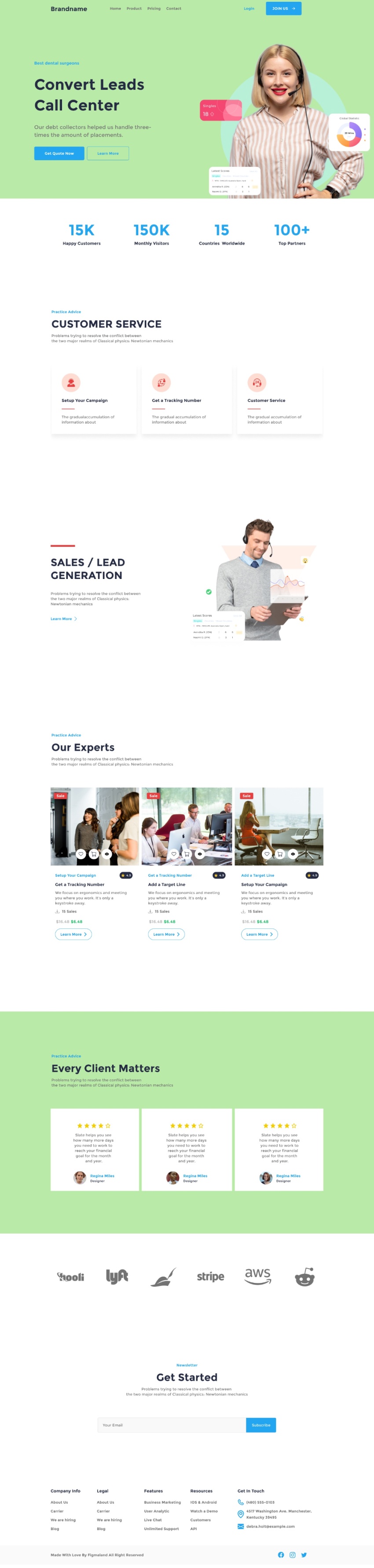
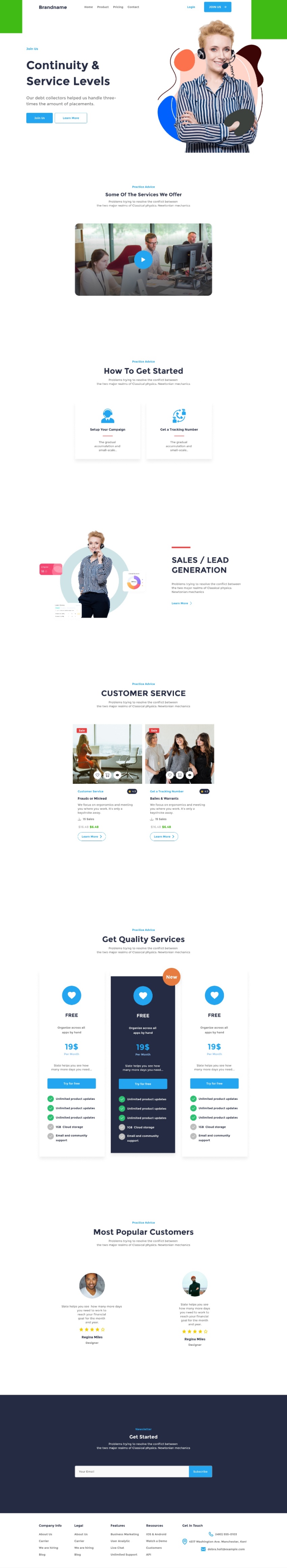

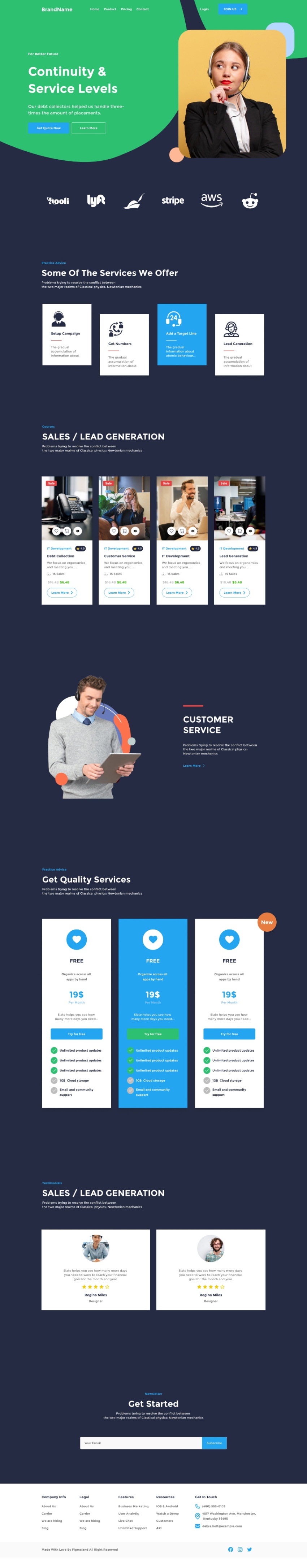
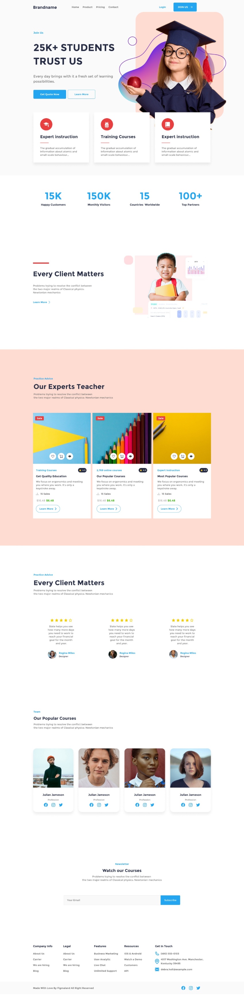

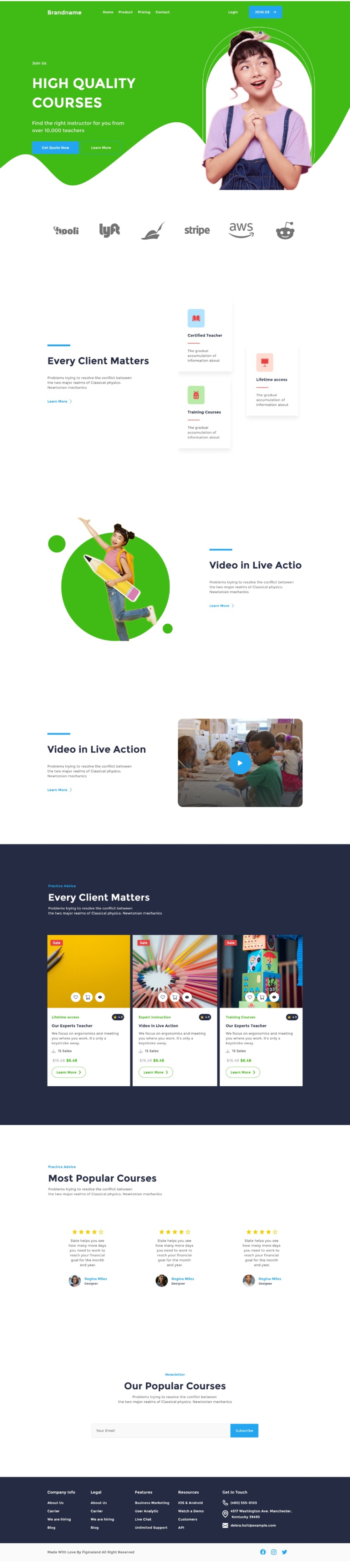

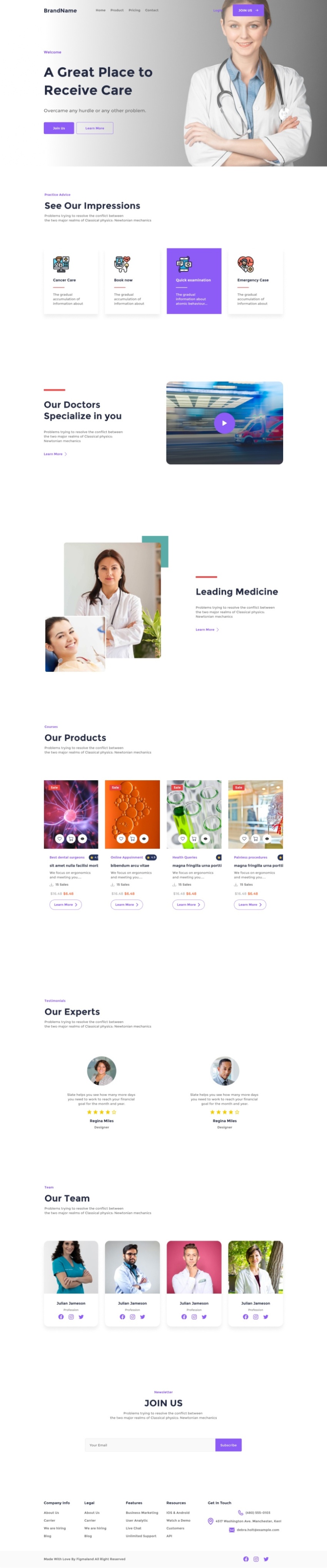
Limitless design combinations to build a complete website for eCommerce, saas,creative solutions, and many other business areas.


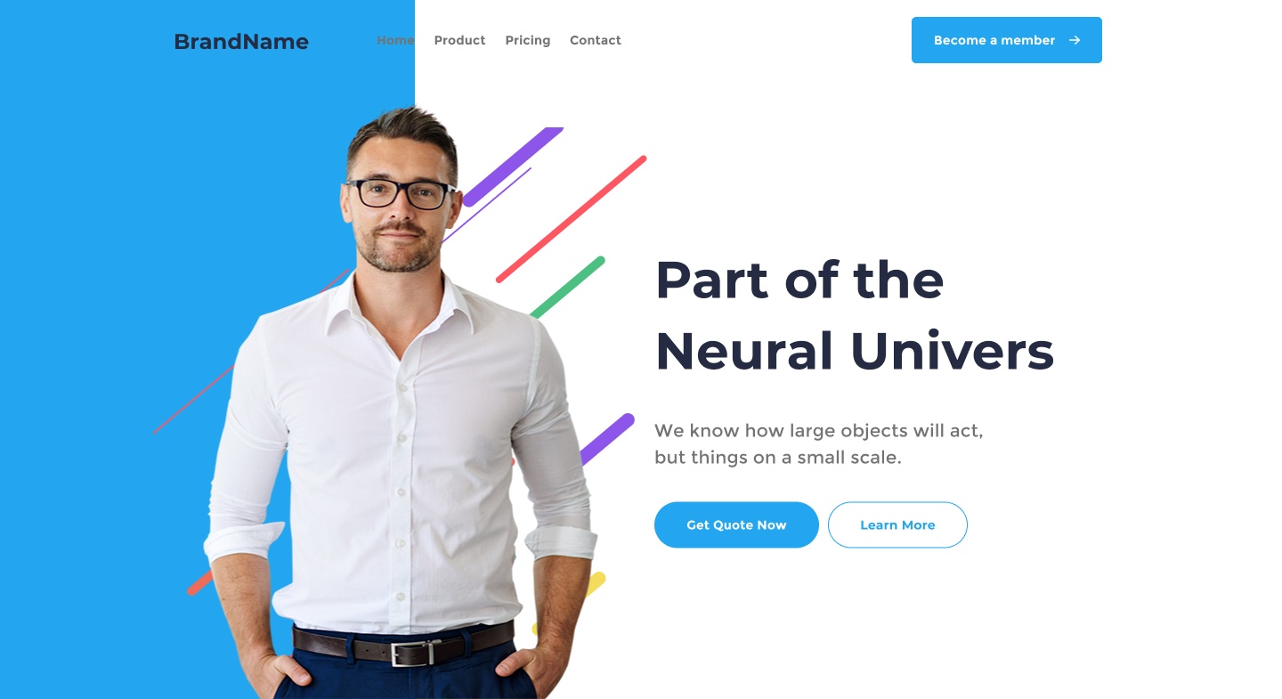


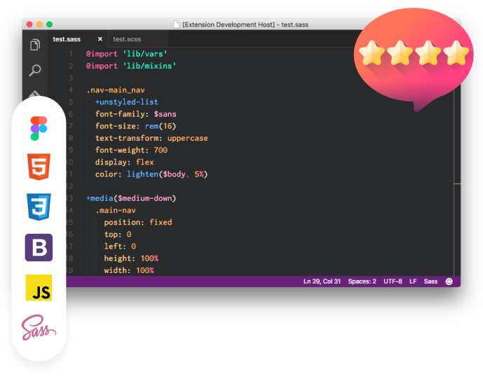
Although you can start directly in HTML, designers usually prefer to start with Figma for quick layout exploration. Theme Composer is fully mapped to Figma, including all the components equipped with auto-layout.
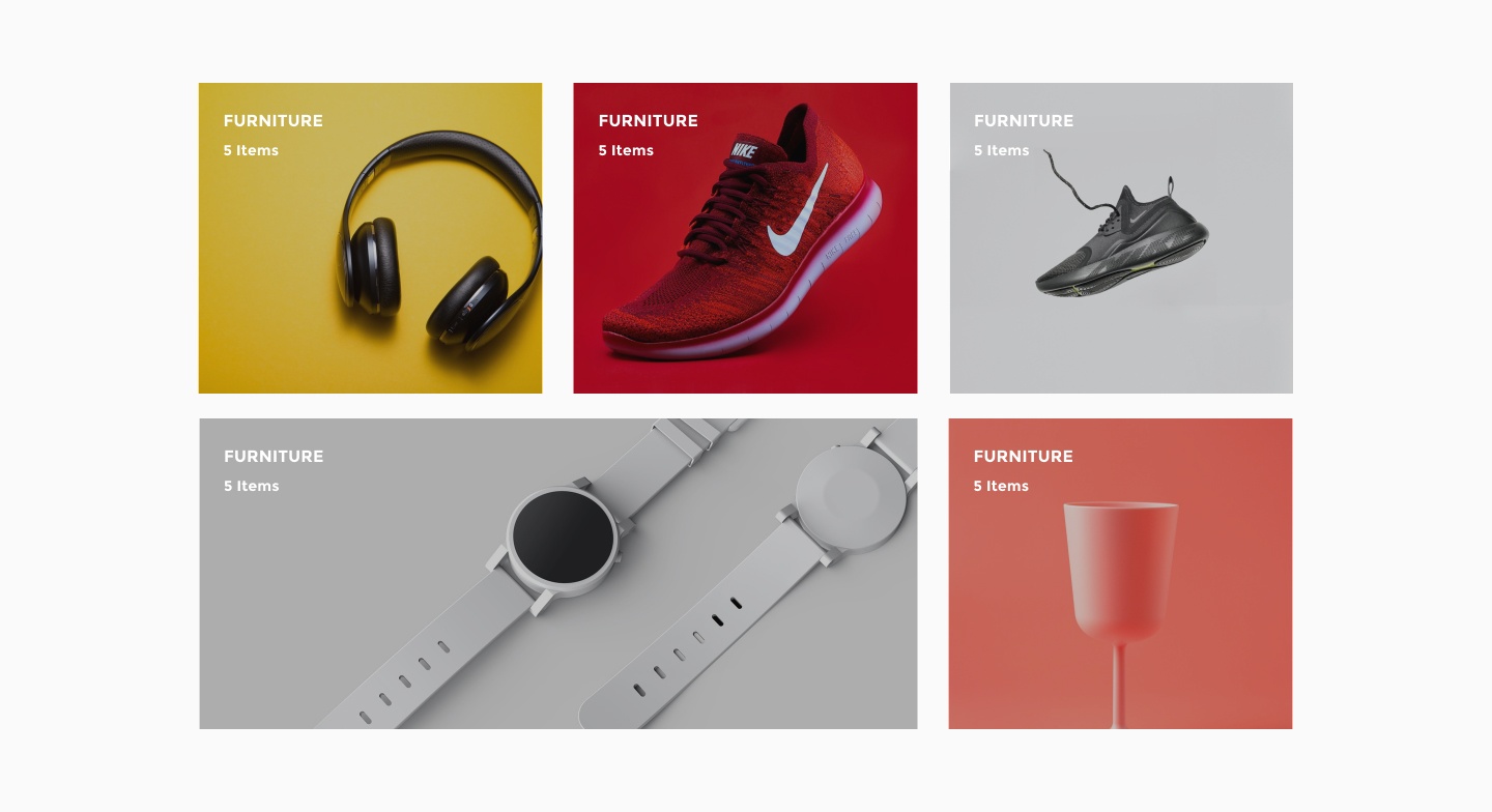
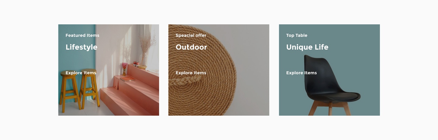
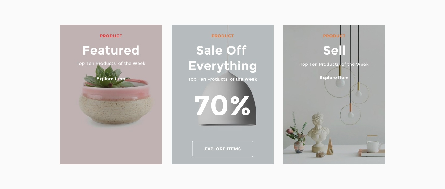
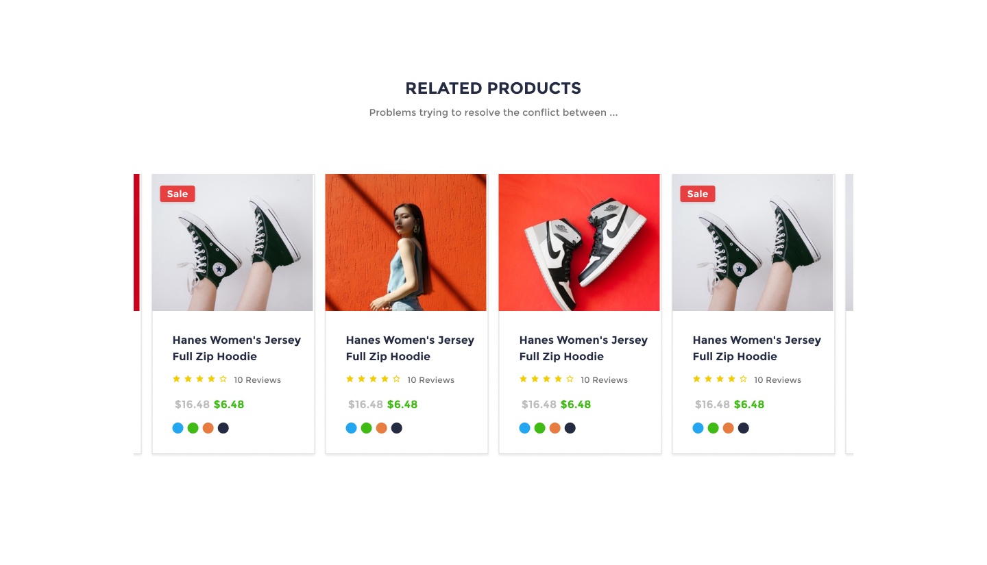
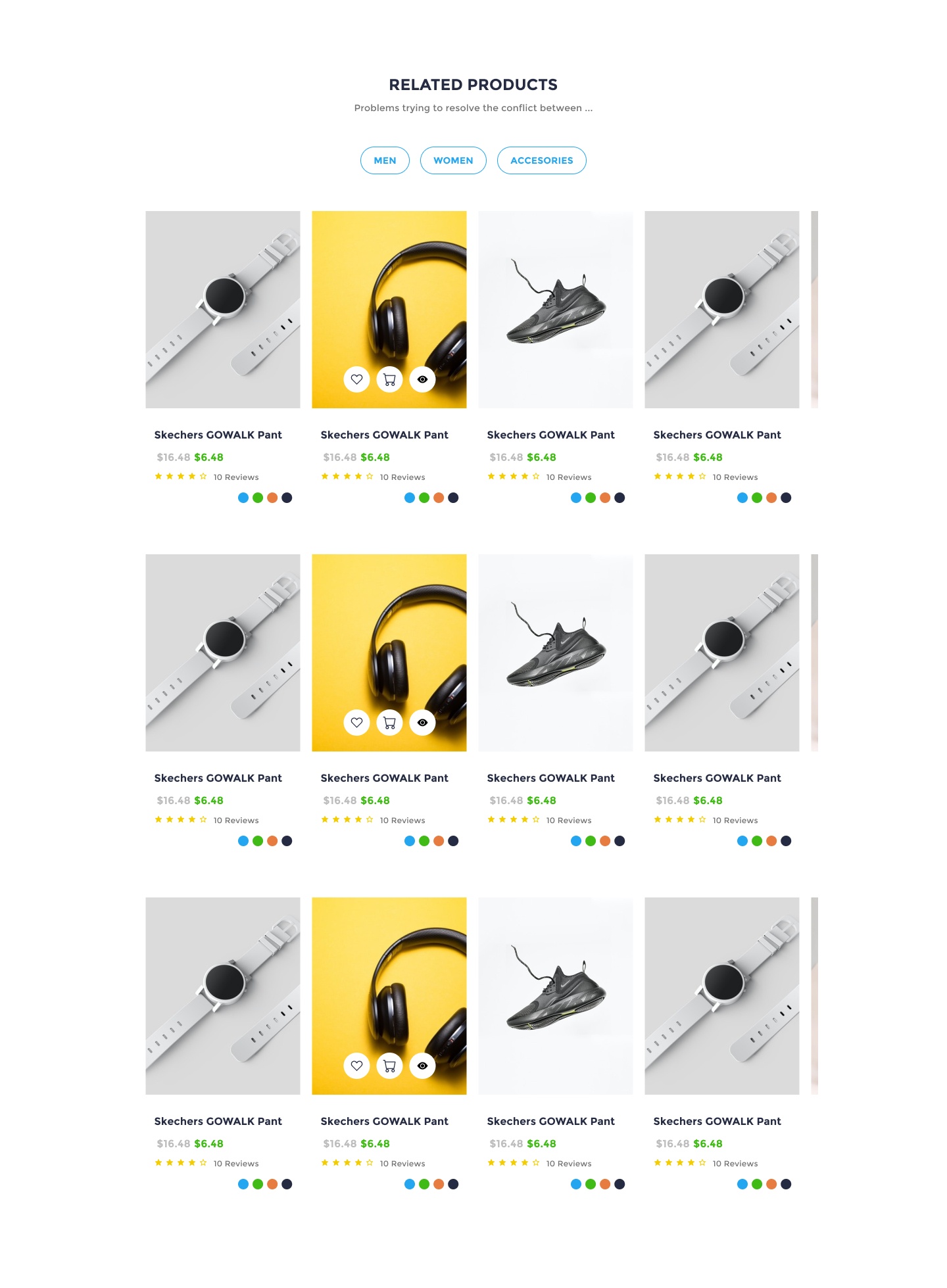
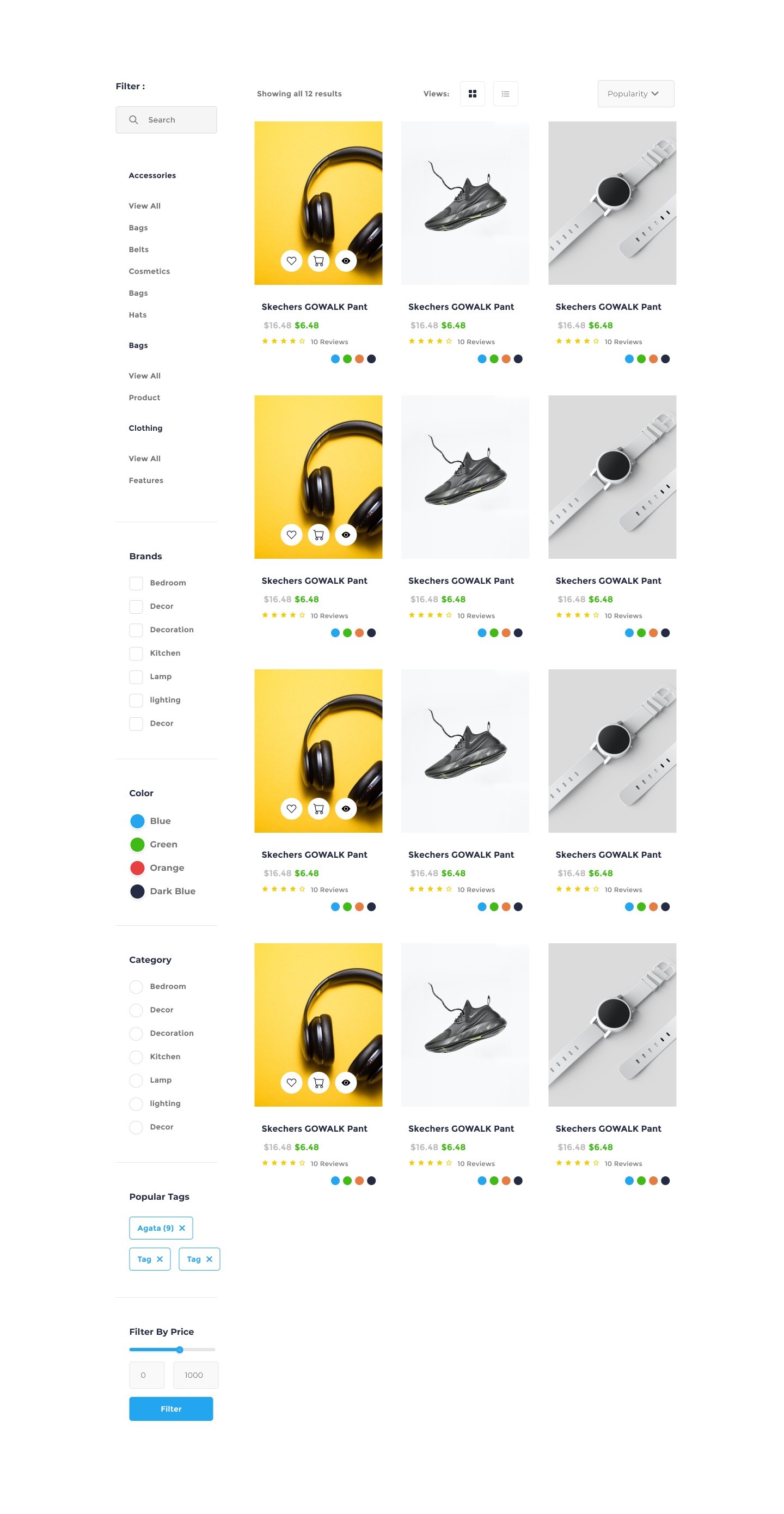
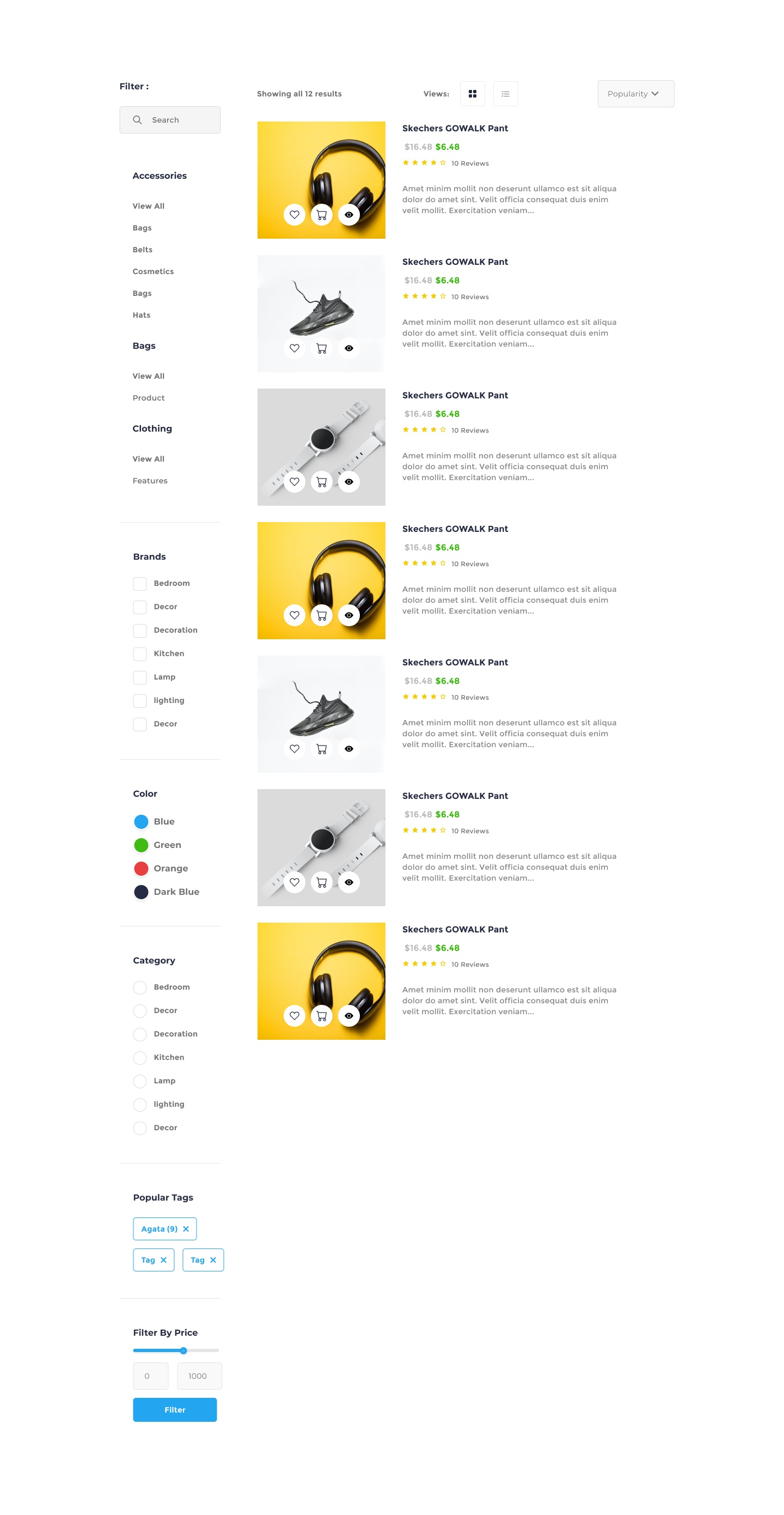
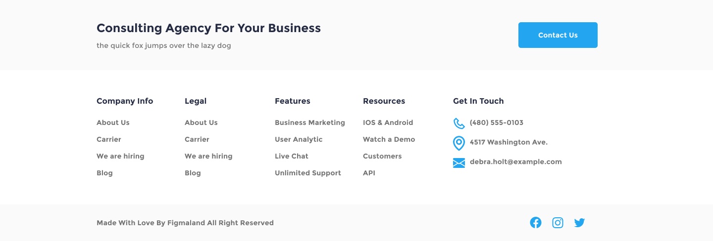
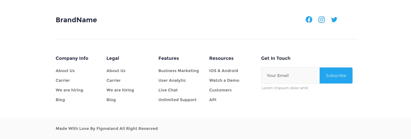
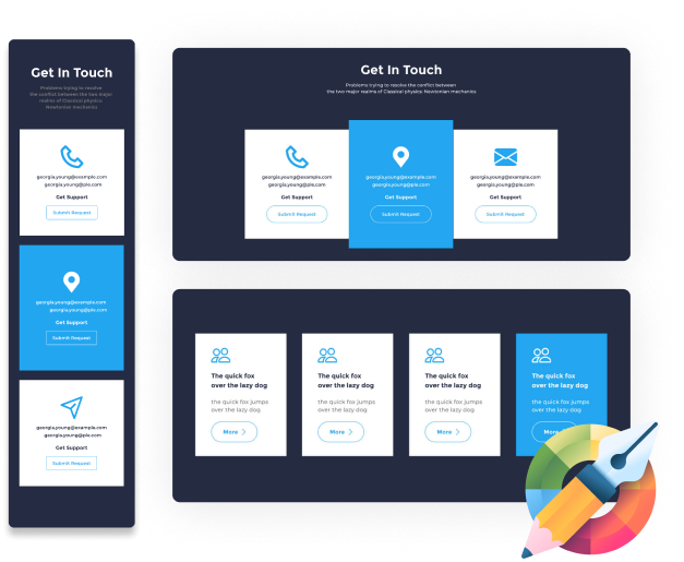
From hero sections and contact forms - we've created 150+ elements that you can use straight away.
We’ve organized the Theme Composer Ui Library where you can easily find the required element.
Newest technology from Figma now gives us the ability to map code Components based on Grid and Flexbox with ease.
There is some basic styling applied to both core elements, such as Fonts and colors, as well as components like buttons. You can use it to quickly prototype and completely customize the look & feel of each component later.
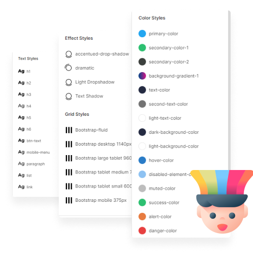
Any change in the Style Guide is effective across all your pages, components and templates.
It really doesn't matter when you adjust the styling - a life saver when client requests a global change after some time.
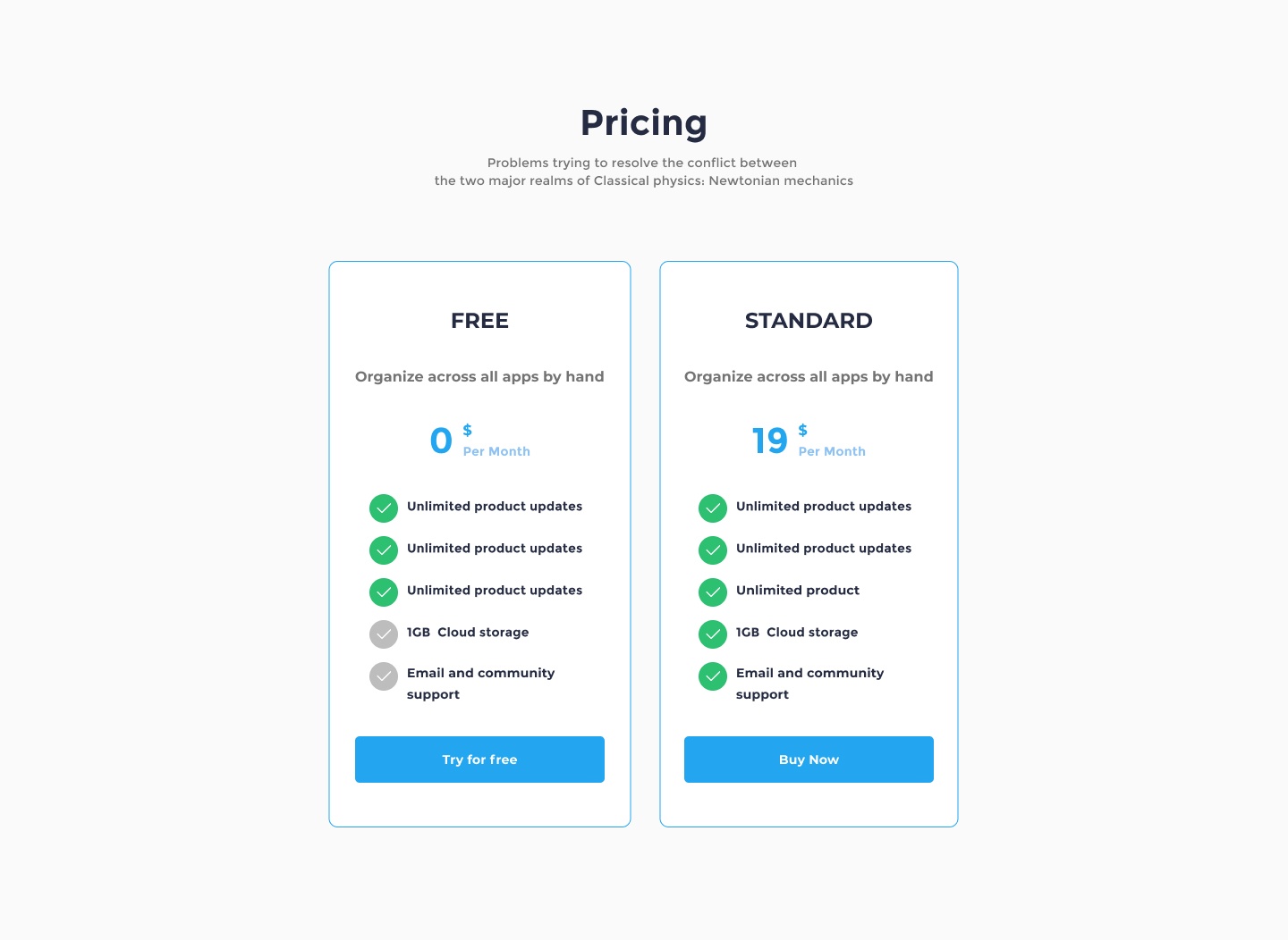
Unlock unlimited possibilities without breaking the bank.
Introducing Theme Composer, a sophisticated Figma plugin that revolutionizes website design by empowering users to create complete websites seamlessly, merging the power of Figma with HTML5 and CSS without the need for coding expertise.
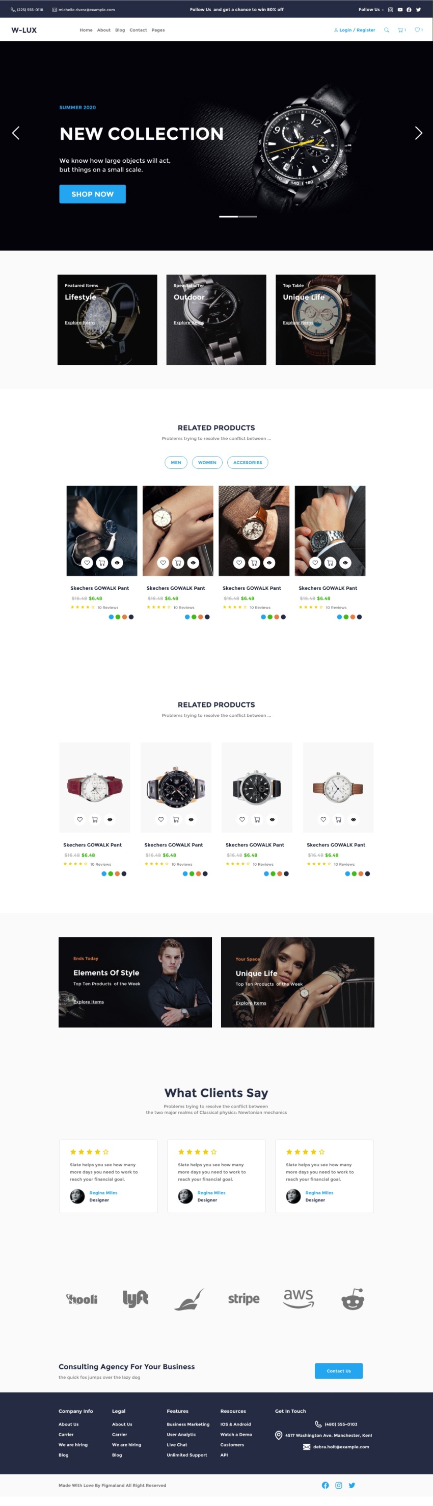
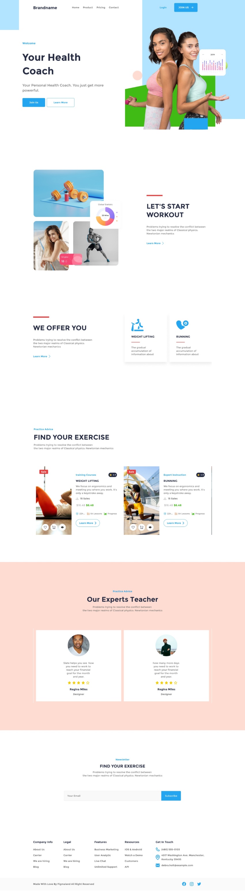
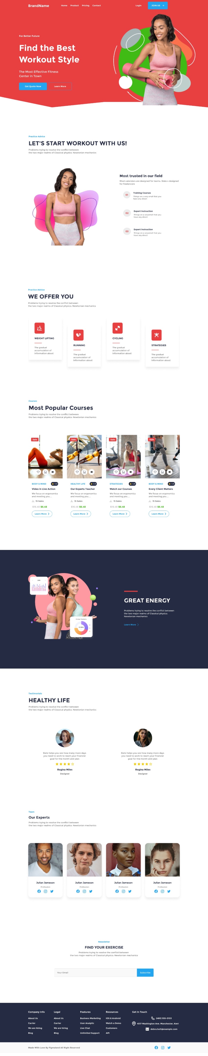
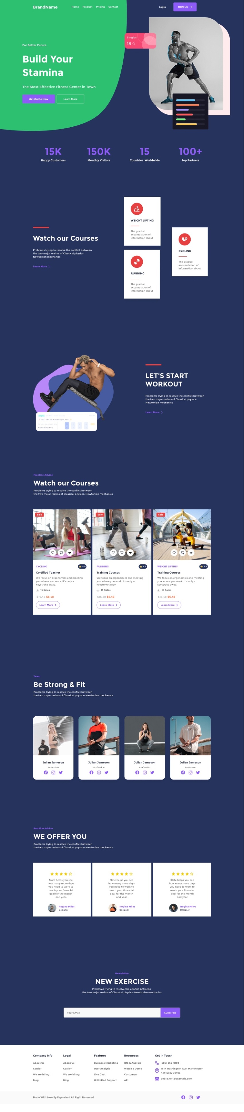
Theme Composer stands out with its meticulously crafted 150+ UI elements, providing designers with an extensive toolkit for creating custom designs efficiently. Whether it's hero sections or contact forms, these elements are ready to use, enabling quick and hassle-free website development.
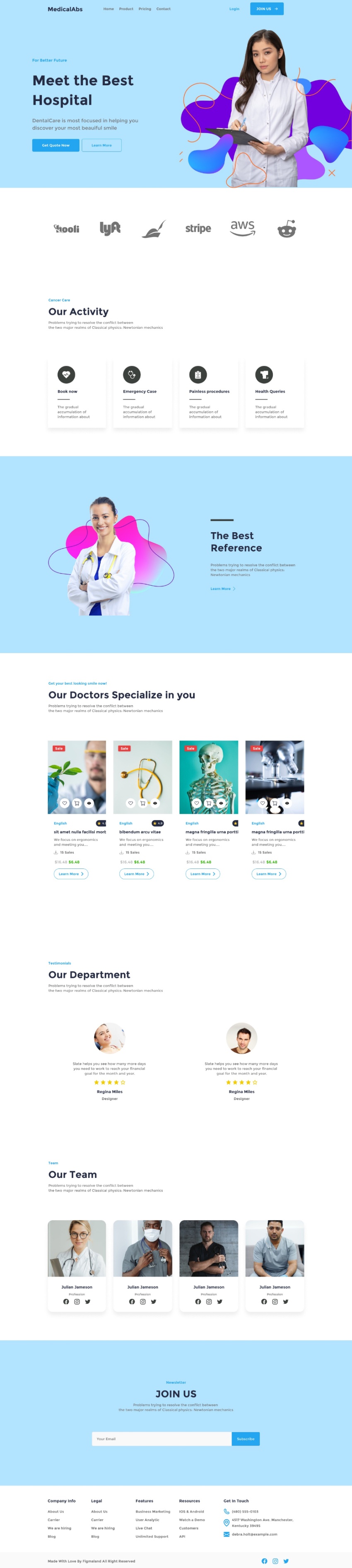
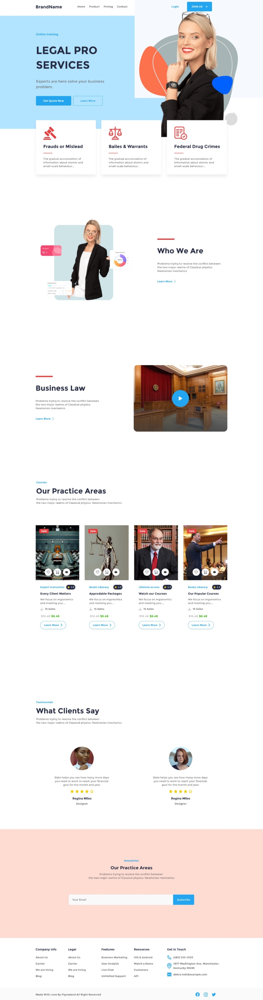
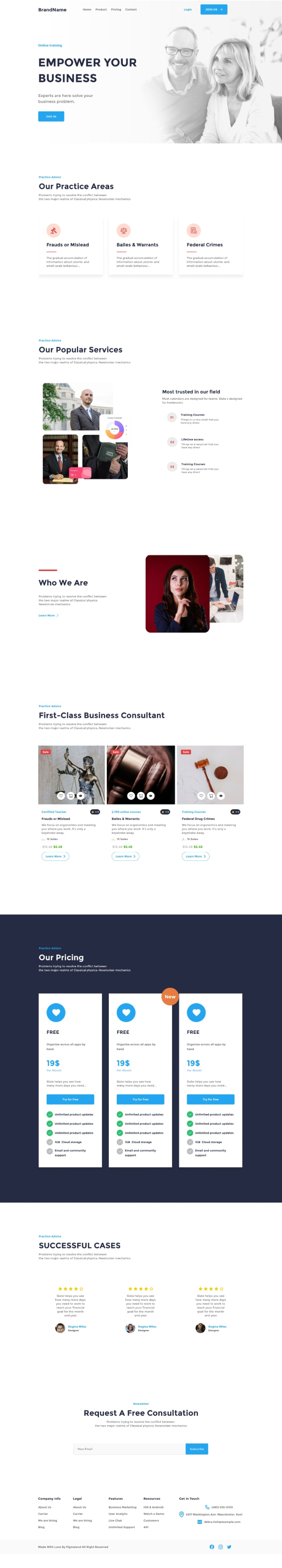
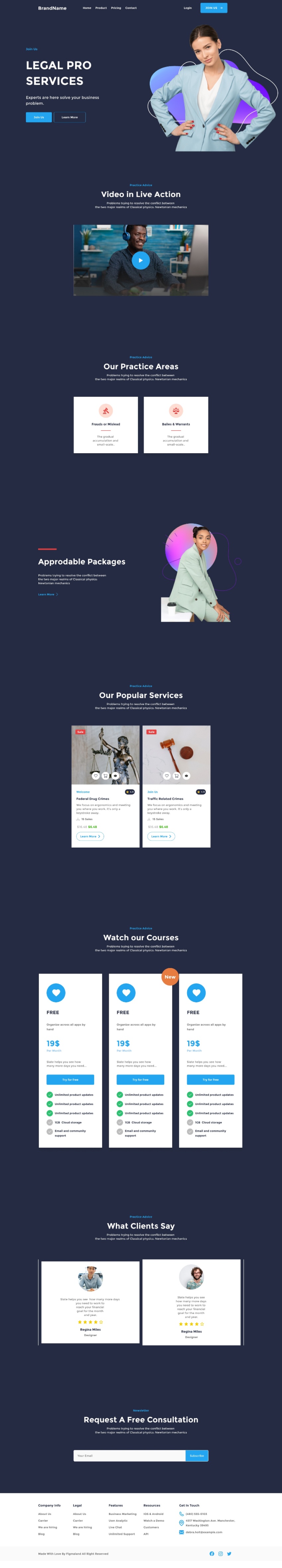
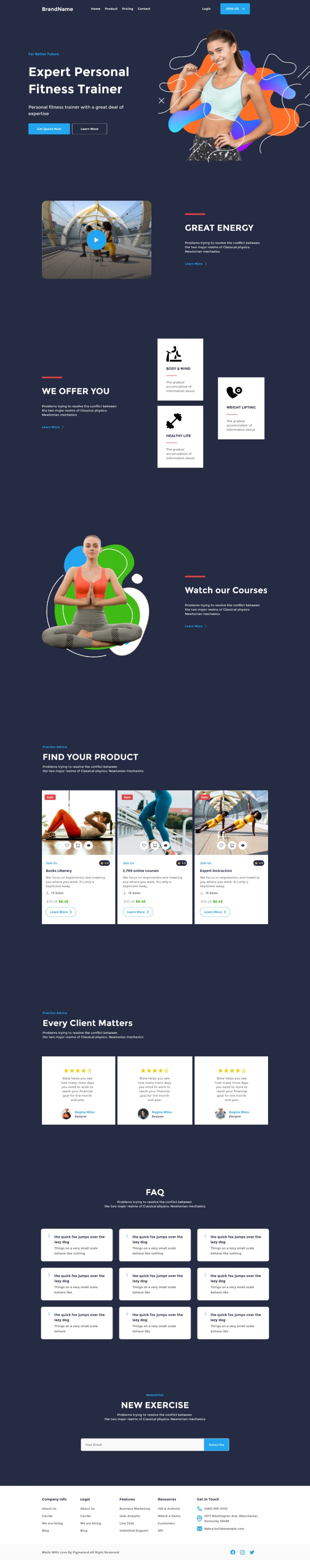
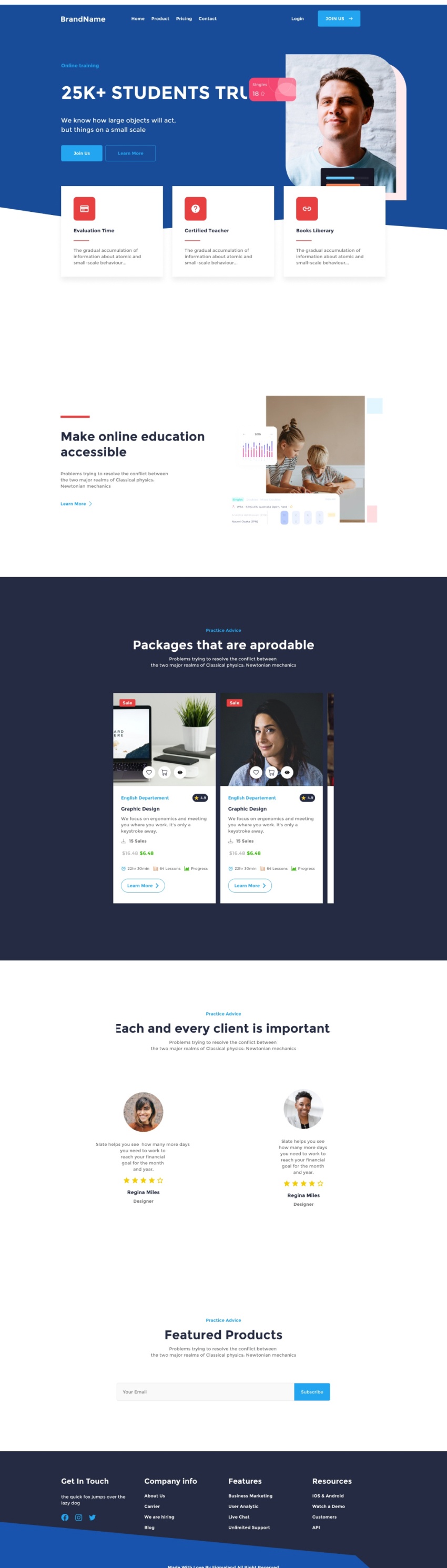
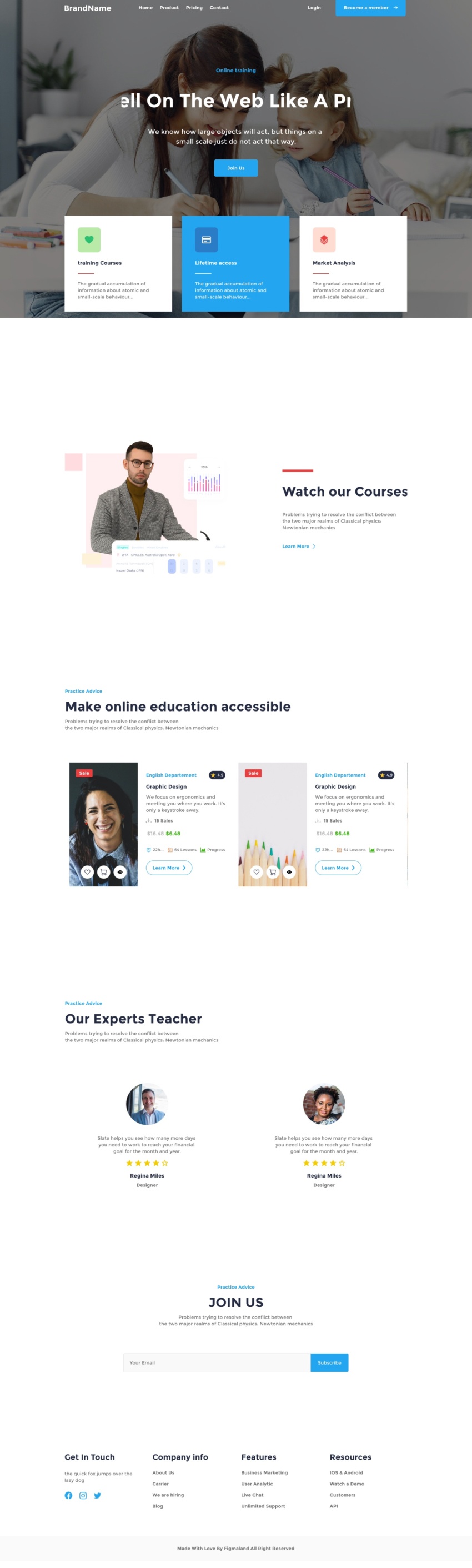
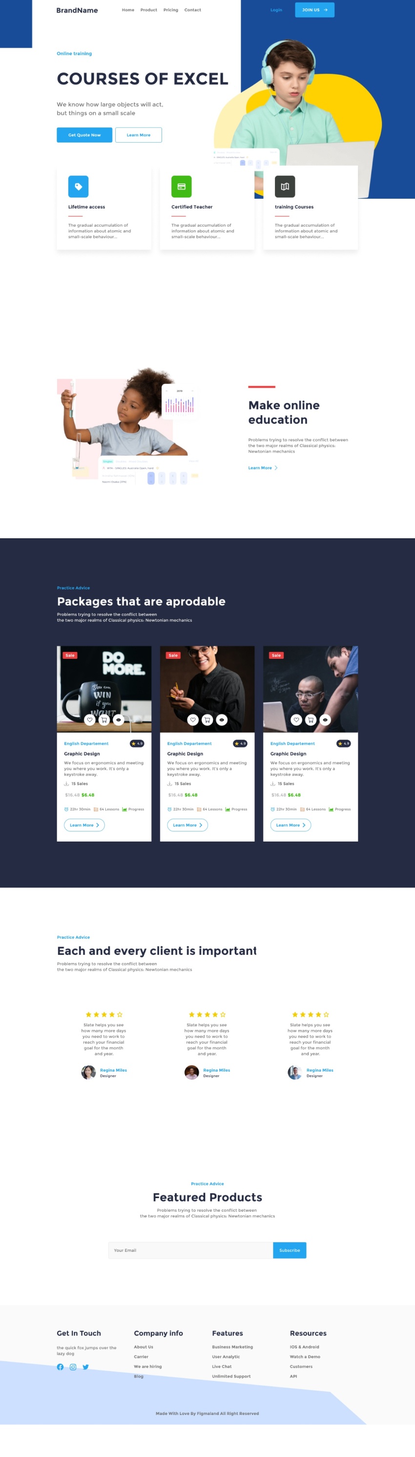
Dive into the world of prebuilt landing pages tailored for diverse business areas such as eCommerce, SaaS, and creative solutions. Theme Composer offers a range of meticulously designed templates, saving valuable time and ensuring a professional and visually appealing web presence.
While you can start directly in HTML, Theme Composer seamlessly integrates with Figma for a streamlined design process. The plugin is fully mapped to Figma, encompassing all components with auto-layout for efficient layout exploration and design ideation.
Facilitating a smooth transition from Figma to HTML is a priority for Theme Composer. Designers can effortlessly migrate their designs, ensuring that the creative vision translates seamlessly from the design canvas to the actual website.
Leveraging the newest technology from Figma, Theme Composer incorporates Auto Layout v.3, allowing for the effortless mapping of code components based on Grid and Flexbox. This advanced feature enhances the precision and flexibility of the design-to-code process.
The Theme Composer UI Library is thoughtfully organized to facilitate accessibility, allowing users to easily locate and implement the required design elements. This structured approach ensures a user-friendly experience for designers of all levels.
With basic styling applied to core elements such as fonts and colors, as well as components like buttons, Theme Composer introduces global styles. This feature enables rapid prototyping while retaining the flexibility to customize the look and feel of each component later in the design process.
50+ Landing Pages: Highlights the variety of prebuilt landing page templates available.
150+ UI Cards: Refers to the extensive collection of UI elements and components.
Figma Auto Layout: Specifies the integration with Figma's Auto Layout feature.
Color and Text Styles: Indicates the availability of predefined styles for colors and text.
HTML 5 + CSS 3: Specifies the compatibility with HTML5 and CSS3 for web development.
Fully Responsive: Ensures that designs created with Theme Composer are responsive across different devices.
1 - Efficient Workflows: Figma plugins enhance productivity by streamlining design workflows. Designers can automate repetitive tasks, reducing the time spent on manual adjustments and edits.
2 - Consistency Across Designs: Plugins that focus on design systems and style guides contribute to maintaining consistency across projects. They ensure that design elements, colors, and typography align with established brand guidelines.
3 - Access to Icon Libraries and Assets: Designers can use plugins to access extensive icon libraries and other design assets. This saves time that would be spent searching for and importing individual icons or graphics.
4 - Accessibility Checks: Certain plugins assist designers in conducting accessibility checks on their designs. This ensures that the user interface adheres to accessibility standards, contributing to a more inclusive design.
1 - Explore and Experiment: Regularly explore the Figma Community to discover new plugins. Experiment with different plugins to find those that align with your specific design needs and preferences.
2 - Stay Updated: Keep plugins up to date to ensure compatibility with the latest Figma features and improvements. Regularly check for updates and explore new plugins that become available in the Figma Community.
3- Customize Workspaces: Tailor your Figma workspace to include essential plugins for your design process. This helps create a personalized environment that aligns with your workflow and preferences.
4 - Community Engagement: Join the Figma Community to engage with other designers and share insights on plugins. Collaborate with the community to discover new use cases and best practices for specific plugins.